April 21, 2022
Mapping the Inequities of Fossil Peaker Power Plants
By Seth Mullendore
Study after study has reenforced the fact that people of color and low-income households are disproportionately bearing the burden of polluting fossil-fuel infrastructure – a fact that comes as no surprise to the many communities facing alarming rates of respiratory ailments and other serious conditions exacerbated by prolonged exposure to toxic emissions. While the findings of such studies are compelling, it can be difficult to translate the numbers into a tangible picture of how communities across the country are being impacted. To help visualize the racial and economic disparities of fossil peaker power plants, Clean Energy Group (CEG) released a new mapping tool highlighting the demographic characteristics of surrounding communities.

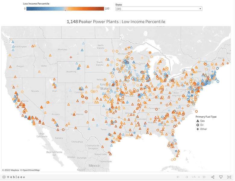
This map shows the relative percentage of low-income household within a 3-mile radius of each peaker power plants. Orange indicates that there is a higher percentage of low-income people in those communities.
CEG’s Peaker Plant Mapping Tool includes operating and emissions information for the more than 1,000 power plants operating to meet peak energy demand across the United States. In 2019, there were 1,148 mostly gas and oil peaker plants in operation, representing over 300 gigawatts of generating capacity. The tool defines a peaker as any combustion-based power plant that ran for 15 percent of the time or less throughout the year, though most of these plants ran far less often. On average, the peakers fired up about 3 percent of the year, less than 300 hours, or the equivalent of roughly 12 days. Because they tend to be some of the dirtiest and most expensive sources of power, peakers typically only operate for a few hours or less each time they’re called upon. But those dirty hours of operation can have an outsized impact on the health of surrounding neighborhoods, spewing out high levels of pollutants on hot days when air quality is often at its worst.
Along with basic plant-level information, the tool allows users to visualize the demographic makeup of communities within a three-mile radius of each peaker plant. Demographics of nearby populations can be viewed based on the percentage of low-income households, defined as household incomes less than or equal to twice the federal poverty level; the percentage of people of color, defined as individuals not identifying as Non-Hispanic White; or an average of low-income and people of color percentages, called the demographic index. Each power plant is color-coded based on where the surrounding population falls in the national percentile for the selected demographic indicator, with blue representing a low percentile and correspondingly low percentage and orange representing a high percentile and high percentage relative to the rest of the country.
The results are striking.
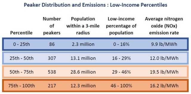
The majority of peaker plants are sited in communities that have a higher than average percentage of low-income residents. Two-thirds of peakers, 755 in total, are surrounded by communities where at least 29 percent of households are classified as low income. Not only are lower-income communities more likely to have a peaker nearby, they are also more likely to live near dirtier peakers. On average, nitrogen oxide (NOx) emission rates are 11 percent higher for peakers impacting lower-income populations than the nationwide average emissions rate for a peaker plant. Long-term exposure to NOx can cause severe damage to the respiratory system and lead to other serious health conditions.
The disparity is even more pronounced when comparing peakers in communities having the lowest percentages of low-income households with those having the highest percentages. Eighty-seven peaker plants are located in communities ranking in the lower 25th percentile for low-income households, where less than 17 percent of households are low income. Those communities represent about 2 million people. Peaker plants in these communities emit an average of 9.9 pounds of NOx per megawatt-hour (lb/MWh), 38 percent below the national average of 16.1 lb/MWh. There are 234 peakers sitting next to 12 million people in the upper 25th percentile for low-income households, where at least 46 percent of households are classified as low income. Those households are subject to NOx emissions rates that are 4 percent higher than average.
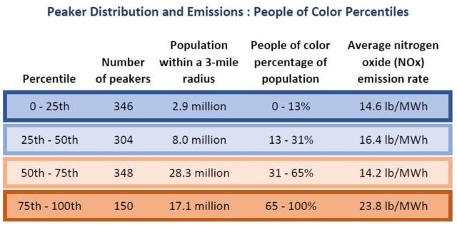
Communities predominately composed of people of color face even higher emission rates. For populations where the percentage of people of color is 65 percent or higher, the upper 25th percentile, peaker plant NOx emissions are 44 percent higher than average, at 23.8 lb/MWh. The are 150 peakers within three miles of the 17 million people represented by this group of racially diverse communities. Peaker-adjacent communities in the lower 25th percentile for percentage of people of color are subject to NOx emission rates that are 9 percent below average.
These examples highlight just a few high-level findings illustrating racial and economic disparities resulting from the unjust distribution of fossil peaker plants and their emissions. Zooming in on specific regions, states, and metropolitan areas can bring to light even more detailed narratives about which communities are and are not being most impacted.
The data powering the map, which comes from the Environmental Protection Agency’s Power Plants and Neighboring Communities Mapping Tool, can be easily downloaded from the tool, so that communities can gather the information they need to support peaker plant opposition efforts and local and state policymakers can make more informed decisions about prioritizing equity in accelerating the retirement of polluting peakers and incentivizing the development of local renewables and energy storage to meet peak demand.
CEG will be hosting a webinar on June 23 to introduce the mapping tool and hear from two community-based organizations, UPROSE and Berkshire Environmental Action Team, that are working to oppose peaker plants impacting their communities – read more here.


